大家好!在這篇文章中,我想帶大家認識新的滾動驅動動畫 API。
# scroll-driven animations
什麼是捲動畫面時會驅動的動畫呢?
當我們在網頁上滾動時,有些動畫會隨著滾動的動作而觸發。以下是兩個範例:
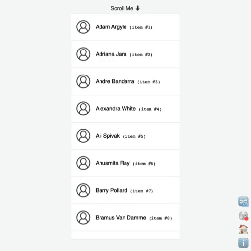
當使用者滑動畫面時,頁面最上方和最下方的物件會展現出平移和淡出的效果。
使用者在滑動畫面時,最上方會展示進度條的動畫效果。
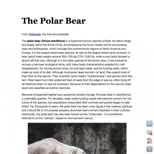
這些都是典型的捲動驅動的動畫效果。
# Classic way
傳統上,我們會使用 addEventListener 來監聽滾動事件,並在主執行緒 (main thread) 上執行 callback function。例如,以下的程式碼展示了如何根據滾動的百分比調整進度條的寬度:
<body>
<div id="progressBar"></div>
<script>
const progressBar = document.getElementById('progressBar');
window.addEventListener('scroll', function() {
// Calculate the scroll progress in percentage
const totalHeight = document.body.scrollHeight - window.innerHeight;
const scrollPosition = window.scrollY;
const scrollPercentage = (scrollPosition / totalHeight) * 100;
progressBar.style.width = scrollPercentage + '%';
});
</script>
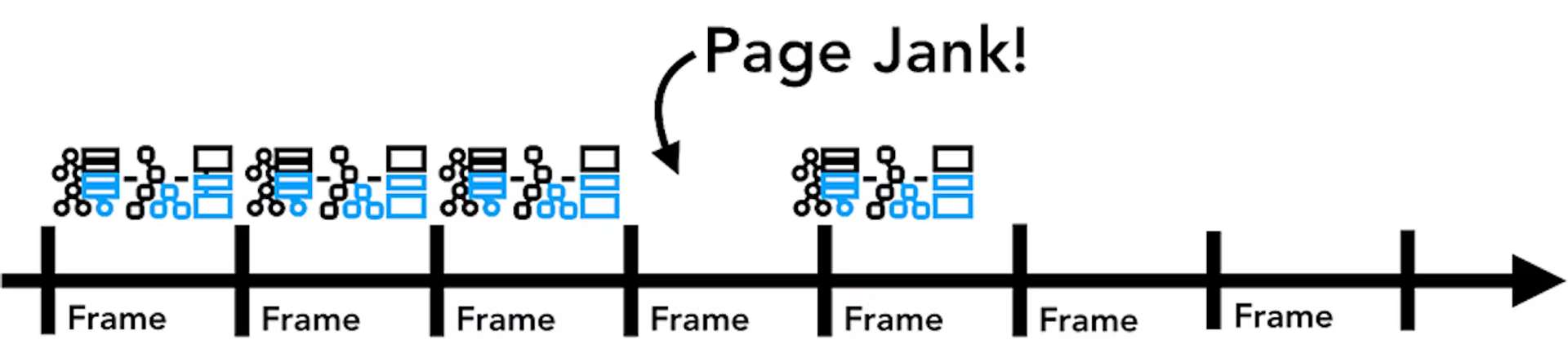
</body>但這種方法可能會導致動畫在連續的幀之間錯過渲染,造成頁面出現不流暢的效果,這種現象稱之為 "janky"。
# new in web animations
Chrome 的新 API 提供了一種宣告式的方法來實作滾動驅動的動畫,並確保動畫在非主執行緒上運行。這使得開發者能夠更精確地控制動畫的播放時機。
例如,以下的程式碼展示了如何使用 scroll-timeline 和 view() 來實作滾動驅動的動畫:
# 滾動進度時間線
<body>
	<div id="progress"></div>
	…
</body>
html {
	scroll-timeline: --page-scroll block;
}

@keyframes grow-progress {
	from { transform: scaleX(0); }
	to { transform: scaleX(1); }
}

#progress {
	position: fixed;
	left: 0; top: 0;
	width: 100%; height: 1em;
	background: red;

	transform-origin: 0 50%;
	animation: grow-progress auto linear;
	animation-timeline: --page-scroll;
}
# 視圖進度時間線
@keyframes animate-in-and-out {
	entry 0%  {
		opacity: 0; transform: translateY(100%);
	}
	entry 100%  {
		opacity: 1; transform: translateY(0);
	}

	exit 0% {
		opacity: 1; transform: translateY(0);
	}
	exit 100% {
		opacity: 0; transform: translateY(-100%);
	}
}

#list-view li {
	animation: linear animate-in-and-out;
	animation-timeline: view();
}
# 總結
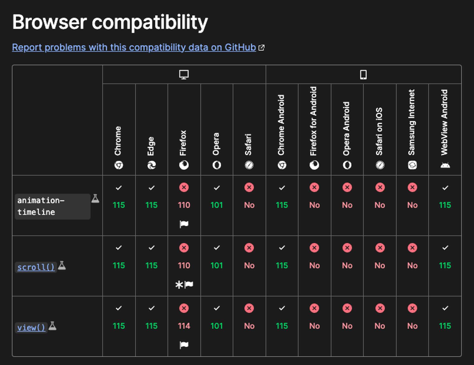
新的滾動驅動動畫 API 提供了一種更簡單的方法來實作絲滑的動畫效果,但是目前看起來並不是所有瀏覽器都支援。
如果在閱讀過程中有任何疑問或建議,請隨時留言告訴我。謝謝大家!😃
# 參考資料
- [Blog](Animate elements on scroll with Scroll-driven animations)
- [Blog](Inside look at modern web browser (part 3))
- [Document](Scroll-driven Animations)
關於作者
喜歡有趣的設計