本文要來介紹 LitElement 這個套件
# 前言
先前有寫過一篇關於「用 Web Component 製作客製化表格元件」的文章,當中有介紹了很多 web component 的基本概念,以及製作表格的方向。
這篇文章要來沿用相同的基礎,把其他各式各樣常見的元件,利用相同的技術實作出來。
# 注意事項
Design System 使用 LitElement 套件來實作元件,由於此套件利用 ES6 語法撰寫,要注意引入專案的執行的環境,以及打包流程要能夠支援 ES6 語法。
# Web Component 簡介
web component 可以讓我們自定義元件,包含 HTML 結構、CSS 樣式、JavaScript,並且取一個自己喜歡的標籤名稱(例如:<wc-button></wc-button),插入到頁面上就能得到一個封裝好的組件。
由於 Web Component 是利用 Browser 原生支援的 Custom Elements 來渲染共用元件的,所以能共用在任何前端框架上,非常符合我們對於元件庫的需求。它的概念其實跟 React 的 class component 有幾分類似,都能讓我們自定義一個元件的架構跟樣式,並使用在其他地方,只是它還有一些需要另外去熟悉的特性,例如 shadow DOM 的概念。
shadow DOM 允許我們創建一些完全獨立於其他元素的 sub-DOM trees,什麼意思呢?有點像我們組裝模型一樣,有一個可以組裝用的接口,讓我們裝上別的手臂或武器之類的,而且裝上去的部位跟模型本身不會相互影響。
可以參考下圖:我們可以利用 shadow-host 這個節點,裝上一個 shadow-tree
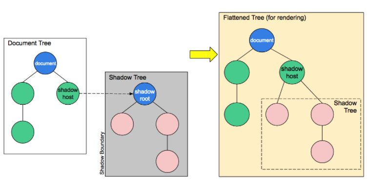
(圖片來源: https://developer.mozilla.org/zh-CN/docs/Web/Web_Components/Using_shadow_DOM)
Shadow DOM 的操作方式跟一般我們常操作的 DOM 是相同的,可以新增屬性、增加 child node...等等,但是我們沒辦法直接透過外部來修改 Shadow DOM 底下的元件。
比如說下面這個 HTML 的架構:
<div class=".wrapper">
  <wc-element>
    #shadow-root
    <!---->
    <button class="wc-btn">...</button>
    <!---->
  </wc-element>
</div>
如果我們想要透過外部的 .wrapper 來調整底下 .wc-btn 的顏色是無法調整的:
.wrapper .wc-btn {
  color: red;
}
相反的 Shadow DOM 内部的元素也不會影響到外部。
由於這個特性,使得我們可以封裝一個具有獨立功能的 <wc-table> 元件,並且可以保證不會引用到專案的同時影響到其它 DOM 元素。shadow DOM 和標準的 DOM 一樣,可以設置它的樣式,也可以用 JavaScript 操作它的行為。DOM 和 shadow DOM 創建的獨立組件之間的互不干擾,有利於組件在各個專案的復用。
# 元件的基本概念
要來實作元件以前,首先要先了解元件的基礎要素有哪些:
- Templates:定義 html 的架構
- Styles:定義 css 的內容
- Properties:定義外部傳進來的參數
- Events:定義元件的行為事件
- Lifecycle:定義元件的生命週期
# Templates
定義 template,只需要透過簡單的 render function,在裡頭 return 一個 html 模板,如下面這段程式碼可以讓我們定義好一個 button 元件。
import { LitElement, html } from 'lit-element';

class MyButton extends LitElement {
  render() {
    return html`<button>按鈕</button>`;
  }
}
我們可以利用 customElements.define 來定義這個元件的標籤名稱,
例如說我們如果希望這個元件叫做 wc-button:
// 我們可以透過兩種方式來定義:
1. customElements.define('wc-element', MyButton);
2. @customElement('wc-button');
我們也可以預先定義好變數,在 template 中帶入:
import { LitElement, html } from 'lit-element';

class MyButton extends LitElement {
  constructor() {
    super();
    this.content = '按鈕';
  }

  render() {
    return html`<button>${this.content}</button>`;
  }
}
# 特殊情境
☞ 條件渲染
如果遇到需要依照條件來決定 html 結構的情況,我們可以利用「三元運算子」來實作:
class MyButton extends LitElement {
  constructor() {
    super();
    this.type = 'primary';
  }

  render() {
    return html`
      <div>
        ${this.type === 'primary' ?
          html`<button>primary</button>` :
          html`<button>secondary</button>`
        }
      </div>
    `;
  }
}
☞ 迴圈渲染
如果遇到多筆資料我們可以透過 map 來實作迴圈渲染:
class MyButton extends LitElement {
  constructor() {
    super();
    this.myArray = ['primary', 'secondary', 'active', 'error'];
  }

  render() {
    return html`
      <div>
        ${ this.myArray.map(text => html`<button>${text}</button>`) }
      </div>
    `;
  }
}
# Styles
style 是我們用來定義元件 css 的地方,我們可以透過 get styles() 的方式,在裡頭 return 一個 css 模板:
import { LitElement, css, html } from 'lit-element';

class MyElement extends LitElement {
  static get styles() {
    return css`
      div { color: red; }
    `;
  }
  render() {
    return html`
      <div>I'm styled!</div>
    `;
  }
}
我們如果有多組的 css 設定,也可以利用陣列將多個 css 模板給包起來:
static get styles() {
  return [ css`...`, css`...`];
}
如果需要事先定義變數,在 get styles() 裡面帶入,有兩種方式可以實作:
// 第一種方式:
import { LitElement, html, css } from 'lit-element';

const mainColor = css`red`;

class MyElement extends LitElement {
  static get styles() {
    return css`
      div { color: ${mainColor} }
    `;
  }
  render() {
    return html`<div>Some content in a div</div>`;
  }
}

// 第二種方式:
import { LitElement, html, css, unsafeCSS } from 'lit-element';

class MyElement extends LitElement {
  static get styles() {
    const mainColor = 'red';

    return css`
      div { color: ${unsafeCSS(mainColor)} }
    `;
  }
  render() {
    return html`<div>Some content in a div</div>`;
  }
}

customElements.define('my-element', MyElement);
如果我們要針對當下這個元件的樣式做設定,我們需要透過 host: 來定義
static get styles() {
  return css`
    /* Selects the host element */
    :host {
      display: block;
    }

    /* Selects the host element if it is hidden */
    :host([hidden]) {
      display: none;
    }
  `;
}
如果要針對當下這個元件的子元素做定義,我們可以透過 :slotted 來定義
import { LitElement, html, css } from 'lit-element';

class MyElement extends LitElement {
  static get styles() {
    return css`
      ::slotted(*) { font-family: Roboto; }
      ::slotted(p) { color: blue; }
      div ::slotted(*) { color: red; }
    `;
  }
  render() {
    return html`
      <slot></slot>
      <div><slot name="hi"></slot></div>
    `;
  }
}
# 特殊情境
☞ 主題色設定
像 Design-system 會需要 follow 設計稿的主題色,所以我們可以透過定義主題色的方式,方便我們在 css 引入對應的色號
const color = {
	lightPrimary: '#4066ff',
	lightPrimaryDarkerPhase1: '#395be5',
	lightPrimaryDarkerPhase2: '#3351cc',
	lightPrimaryLighterPhase1: '#7994ff',
	lightPrimaryLighterPhase2: '#d8e0ff',
	lightPrimaryLighterPhase3: '#ebefff',
  .
  .
  .
}

static get styles() {
    return [
      css`
        :host {
          --light-primary: ${unsafeCSS(color.lightPrimary)};
          --light-primary-darker-phase-1: ${unsafeCSS(color.lightPrimaryDarkerPhase1)};
          --light-primary-darker-phase-2: ${unsafeCSS(color.lightPrimaryDarkerPhase2)};
          --light-primary-lighter-phase-1: ${unsafeCSS(color.lightPrimaryLighterPhase1)};
          --light-primary-lighter-phase-2: ${unsafeCSS(color.lightPrimaryLighterPhase2)};
          --light-primary-lighter-phase-3: ${unsafeCSS(color.lightPrimaryLighterPhase3)};
          .
          .
          .
        }
      `,
      css`
        :host {
					--button-background_color: var(--light-primary);
					--button-background_color-disable: var(
						--light-primary-lighter-phase-1
					);
					--button-background_color-hover: var(--light-primary-darker-phase-1);
					--button-background_color-active: var(--light-primary-darker-phase-2);
					--button-text_color: var(--white);
					--button-text_color-disable: var(--white);
					--button-text_color-hover: var(--white);
					--button-text_color-active: var(--white);
					--button-border_color: var(--light-primary);
					--button-border_color-disable: var(
						--light-primary-lighter-phase-1
					);
					--button-border_color-hover: var(--light-primary-darker-phase-1);
					--button-border_color-active: var(--light-primary-darker-phase-2);
        }
      `
    ];
  }
# Properties
要定義元件的 properties,我們可以透過這個寫法:
@property(options)
propertyName;
options 當中可以帶入以下幾種參數:
- type:定義此 property 的型態
- reflect:定義屬性是否會反映回關聯的屬性,預設為
false(當我們需要利用 attributeChangedCallback 來做監控,我們就可以將其設定為true) - hasChanged:可以自定義屬性更新的條件,預設為
(newValue !== oldValue)
@property({ type: String, reflect: true })
public value = '';
當 property 更新時,觸發的更新機制:
- property setter 會被呼叫
- setter 會去呼叫 hasChanged 函式判斷目前的變更是否滿足更新的條件,如果回傳的 true 則進入下一步
- setter 會去將 requestUpdate 列入排程
- 元件的 update 會被呼叫,並將 template re-render
詳細資訊可參考 文件 描述
我們也可以自定義 getter 跟 setter:
private _disabled = false;

get disabled() {
  return this._disabled;
}

/**
 * This attribute prevents the user from interacting with the input: it cannot be pressed or focused.
 * @type {Boolean}
 * @default false
 */
@property({ type: Boolean, reflect: true })
set disabled(disabled: boolean) {
  const oldValue = this._disabled;
  if (!!disabled === !!oldValue) {
    return;
  }
  this._disabled = disabled;

  this.requestUpdate('disabled', oldValue);

  this.dispatchEvent(
    new Event('disabled', { bubbles: true, composed: true }),
  );
}
# Events
加上事件監聽的幾個方式:
☞ 加在 element 上
render() {
  return html`<button @click="${this._handleClick}">`;
}
☞ 加在 constructor
constructor() {
  super();
  this.addEventListener('focus', this._handleFocus);
}
☞ 加在 connectedCallback
connectedCallback() {
  super.connectedCallback();
  window.addEventListener('resize', this._handleResize);
}
disconnectedCallback() {
  window.removeEventListener('resize', this._handleResize);
  super.disconnectedCallback();
}
☞ 加在 firstUpdated
async firstUpdated() {
  // Give the browser a chance to paint
  await new Promise((r) => setTimeout(r, 0));
  this.addEventListener('click', this._handleClick);
}
建立 callback function(這邊以建立 handleResize 為例)
// 第一種方式:直接宣告在 class 當中
export class MyElement extends LitElement {
  private _handleResize = () => { /* handle the event */ }

  constructor() {
    window.addEventListener('resize', this._handleResize);
  }
}

// 第二種方式:透過 eventOption
export class MyElement extends LitElement {
  @eventOptions({passive: true})
  private _handleTouchStart() { ... }

  render() {
    return html`
      <div @touchstart=${this._handleTouchStart}><div>
    `;
  }
}
# Lifecycle
生命週期的幾個 hook:
Web Component 內建:
- connectedCallback: 當元件被建立於 DOM tree 的時候呼叫
- disconnectedCallback: 當元件從 DOM tree 移除時呼叫
- adoptedCallback: 當元件被移至別的 document 時被呼叫
- attributeChangedCallback: 當元件的 attribute 有更新時呼叫
LitElement 提供:
- someProperty.hasChanged
- requestUpdate
- shouldUpdate
- update
- firstUpdated
- updated
- updateComplete
☞ someProperty.hasChanged
所有 property 都有自己的 hasChanged,用來定義數值改變時是否要呼叫 update
☞ requestUpdate
當 hasChanged 回傳 true 的時候,requestUpdate 會被觸發,我們也可以手動自行呼叫 requestUpdate 來使元件重新渲染
set prop(val) {
  let oldVal = this._prop;
  this._prop = Math.floor(val);
  this.requestUpdate('prop', oldVal);
}
☞ shouldUpdate
在 requestUpdate 觸發以後,控制是否要繼續執行更新,預設會回傳 true,有特殊條件需要判斷時我們可以使用
shouldUpdate(changedProperties) {
  changedProperties.forEach((oldValue, propName) => {
    console.log(`${propName} changed. oldValue: ${oldValue}`);
  });
  return changedProperties.has('prop1');
}
☞ update
用於將屬性值反映到屬性,以及呼叫 render,一般來說我們不需要自定義一個新的 update 來覆蓋掉預設的。
☞ firstUpdated
於元件 mounted 時觸發,可以用來做元件初次建立時的初始化設定,也可以在這邊加上事件監聽。
public firstUpdated() {
  // if (!this.hasAttribute('role')) {
  //   this.setAttribute('role', 'textbox');
  // }
  // if (!this.inputEl.hasAttribute('tabindex')) {
  //   this.inputEl.setAttribute('tabindex', '0');
  // }

  this.inputEl.style.minHeight = this.minHeight + 'px';
  this._initHeight = this.inputEl.style.height;

  this.addEventListener('click', () => this.inputEl.focus());
}
☞ updated
元件更新完成後觸發,當我們需要在元件更新完成後做事情可以使用
updated(changedProperties) {
  changedProperties.forEach((oldValue, propName) => {
    console.log(`${propName} changed. oldValue: ${oldValue}`);
  });
  let b = this.shadowRoot.getElementById('b');
  b.focus();
}
☞ updateComplete
會回傳 true / false 來表示 update 的流程是否通通結束。
# 實際範例
我們以一個 Button 作為範例:
import { LitElement, html, customElement, property, css } from 'lit-element';

@customElement('wc-button')
export class Button extends LitElement {

	@property({ type: Boolean })
	public disabled = false;

	@property({ type: String })
	public color = 'primary';

  static get styles() {
		return [
			baseCss,
			css`
        :host {
					--button-background_color: var(--light-primary);
					--button-background_color-disable: var(
						--light-primary-lighter-phase-1
        }
        .
        .
        .
      `,
		];
	}

	public handleClick = (event: Event) => {
		if (this.disabled) {
			return;
		}

		const form = this?.closest('form');
		if (form) {
			event.preventDefault();
			const fakeSubmit = document.createElement('button');
			fakeSubmit.type = this.type;
			fakeSubmit.style.display = 'none';
			form.appendChild(fakeSubmit);
			fakeSubmit.click();
			fakeSubmit.remove();
		}
	};

	public connectedCallback() {
		super.connectedCallback();
		this.addEventListener('click', this.handleClick);
	}

	public render() {
		return html`
			<slot></slot>
		`;
	}
}
# 參考資料
- https://developer.mozilla.org/zh-CN/docs/Web/Web_Components/Using_shadow_DOM
- https://the-allstars.com/blog/website-information/what-is-web-components-why-is-it-so-important.html
- https://developer.mozilla.org/en-US/docs/Web/Web_Components/Using_templates_and_slots
- https://vaadin.com/components/vaadin-grid/html-examples/grid-basic-demos
- https://lit-element.polymer-project.org/guide
關於作者
作夢也在寫程式